Napkin advertising,measured by the scan
NapkinAds prints brands on the napkins of more than 200,000 restaurants and bars, with a QR code on every one so a sit-down turns into installs, sign-ups and sales you can count. We built the brand and rebuilt the website from the ground up: a navy identity lit by a single bar light, an illustrated bar counter for a hero, campaign results with real numbers, and a lead form that qualifies the brief and sends it straight into HubSpot.
Brief
Make a napkin feel like a media channel
Napkin advertising sounds like a novelty until you see the numbers. The brand had to do that job for a marketing lead seeing it cold: show what the product is in one look, then prove it performs before anyone has to ask. Plain about the format, serious about the results, and confident enough to sit next to any other media buy.
Identity
A folded corner and a bar light
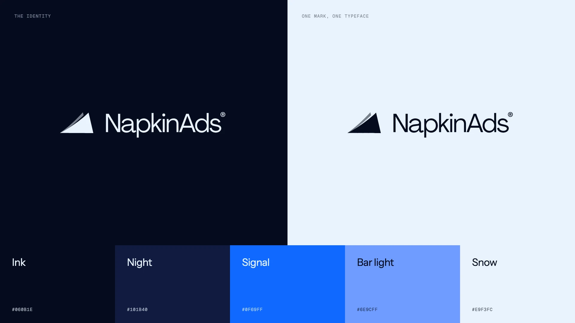
The mark is the corner of a napkin, folded once, sitting in front of a wordmark set in Instrument Sans. Everything else lives at night: ink navy for the room, a deeper navy for surfaces, and one bright signal blue used the way the product works, as the single thing your eye lands on. A pale bar-light blue does the lighting, and snow white is kept for the napkin itself.
Out of home
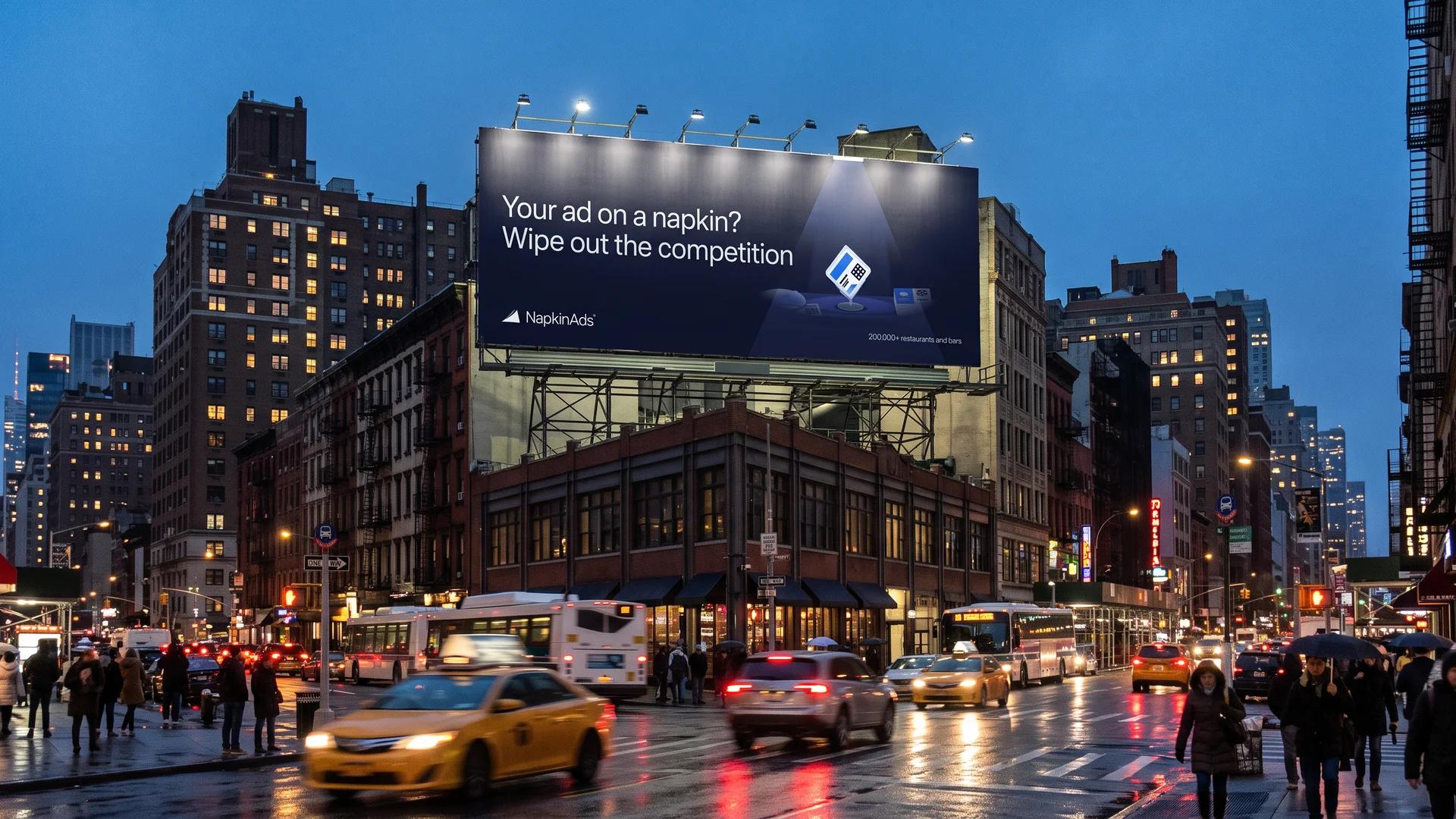
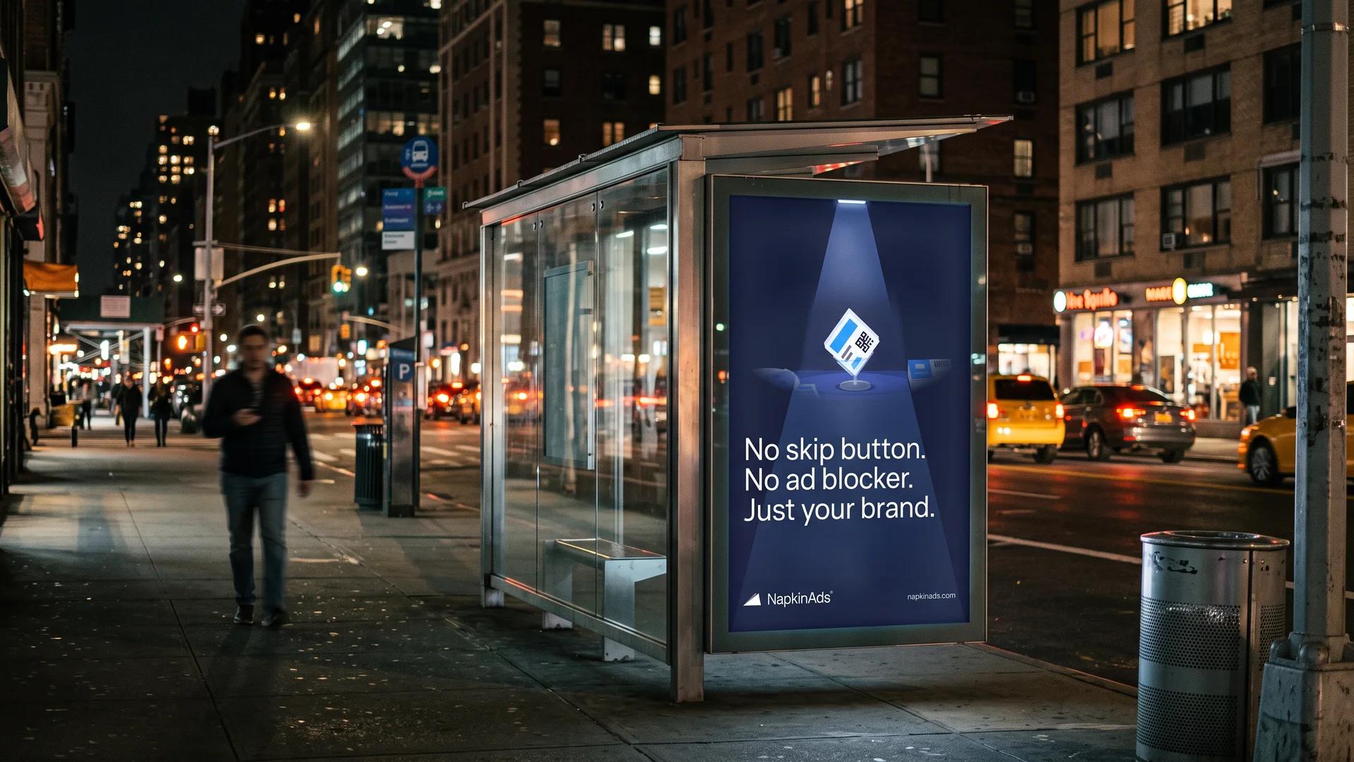
"Your ad on a napkin? Wipe out the competition"
The headline is a pun that sells. It says what the product is, makes the promise in the same breath, and is short enough to read from across an avenue. On a billboard it sits beside the spotlit napkin from the website, so the out-of-home work and the site read as one campaign, not two.
The bar
One light, one napkin, the rest in shadow
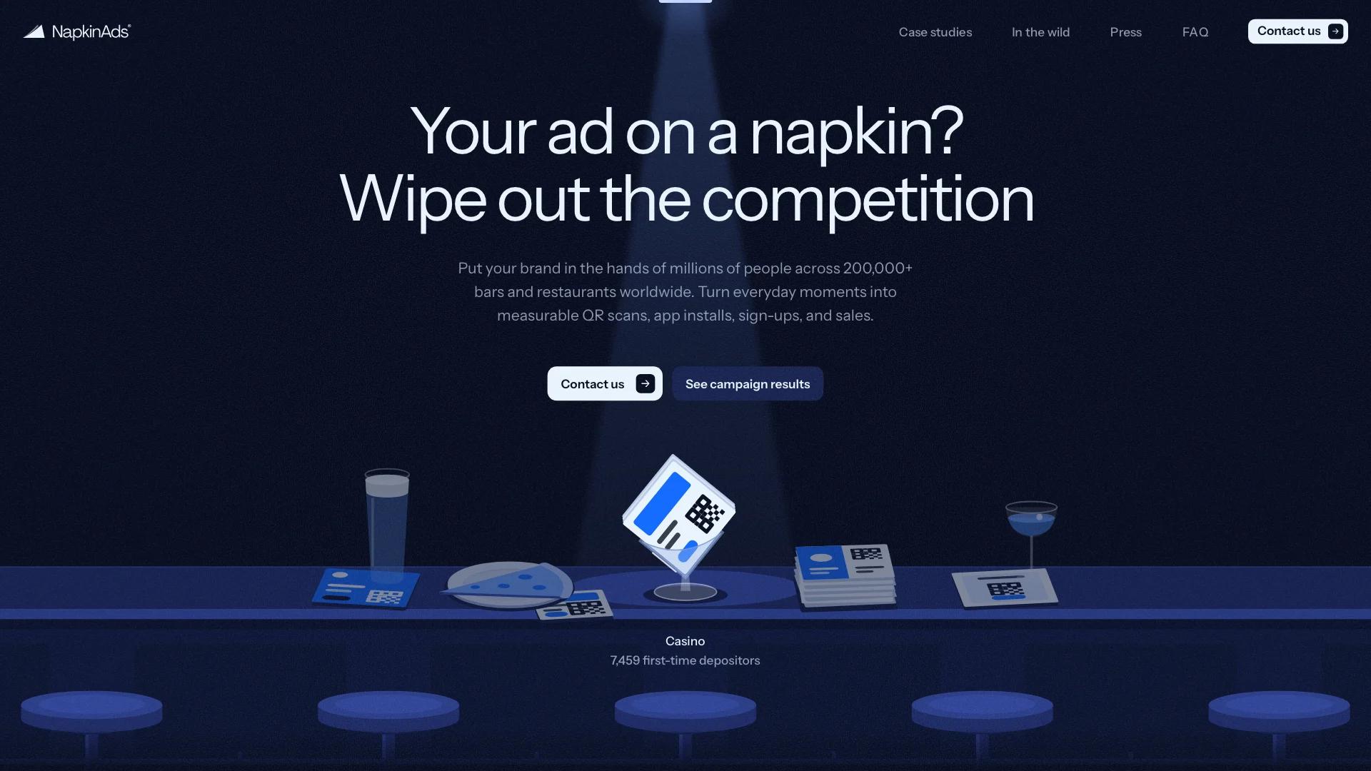
The website opens on an illustrated bar counter seen from slightly above: drinks, a slice of pizza on a plate, a fresh stack, and a clear stand in the middle, the way napkins actually sit in NapkinAds venues. Everything is drawn in flat navy tones so the napkins are the only bright thing in the scene. A bar light swings along the counter and stops on each setting, and the campaign it is printed for shows underneath.
In the wild
Proof that it is real, before proof that it works
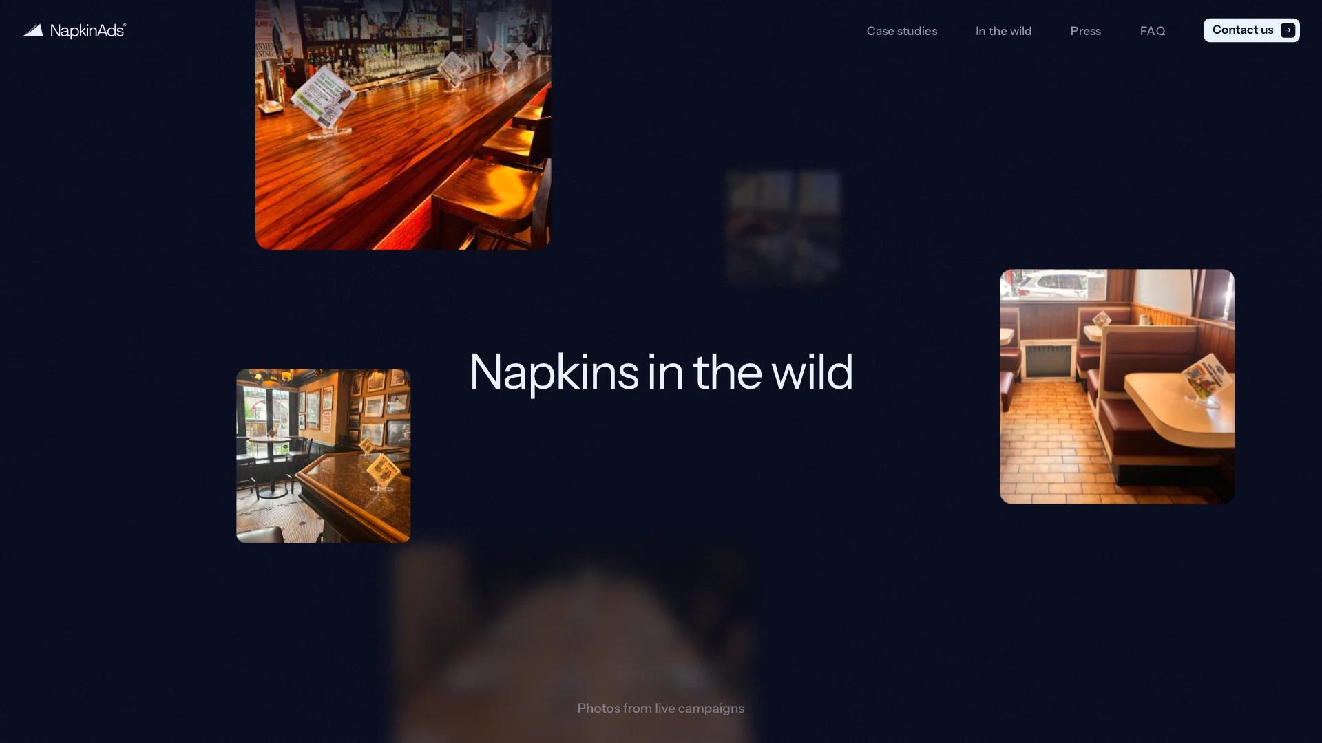
Straight after the hero, the page leaves the illustration and goes to photography: branded napkins on real tables, alternating bars and restaurants. The photos scale in around the title as you scroll, so the first thing a sceptical buyer sees after the pitch is the product in the hands of actual customers.
Results
Budget in, outcome out
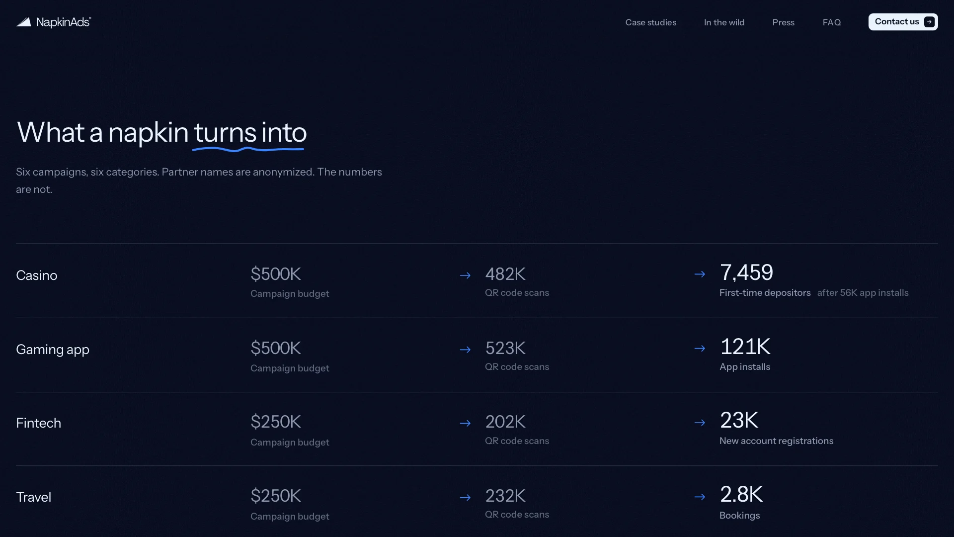
Each campaign is one row that reads left to right: what was spent, how many people scanned, and what that turned into. Casino, gaming, fintech, travel, insurance and legal, each with its own outcome: first-time depositors, installs, registrations, bookings, quote requests and leads. Partner names stay anonymous. The numbers count up as they arrive and are never rounded into adjectives.
The argument
No skip button. No ad blocker.
Why napkins comes down to one line: a napkin sits in front of your customer for the whole meal, and nothing gets between it and them. On the site it lights up word by word as you scroll, backed by four figures: network size, monthly reach, how many people read the napkin and how many scan it. On the street it becomes a poster with nothing else on it but the bar light.
Beyond the table
The campaign keeps going after the meal
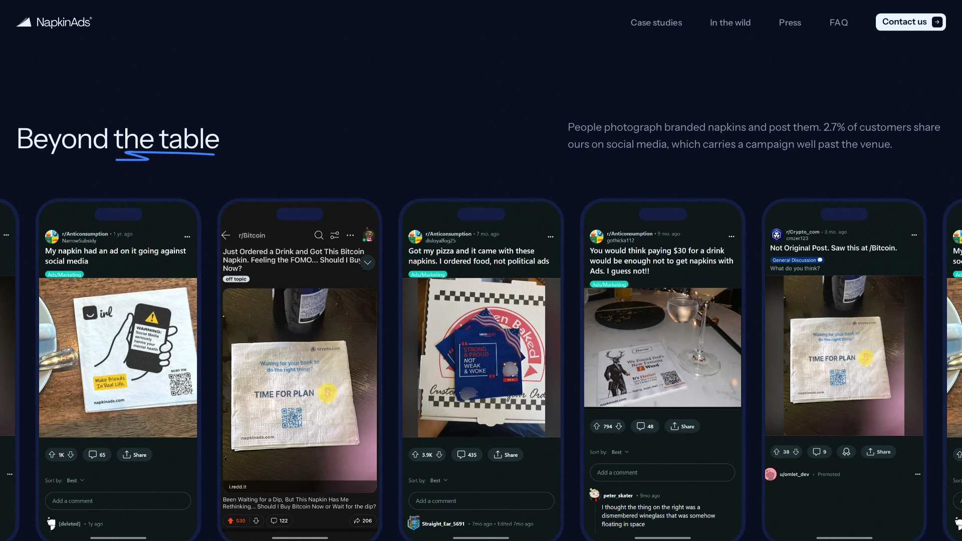
People photograph branded napkins and post them, so the site shows them doing it: real posts set in phone frames on a carousel. It is the reach a media plan never accounts for, shown rather than claimed. From there the page closes on press coverage, a short FAQ and a form that asks for budget, markets and timing, so every lead arrives in HubSpot already qualified.
On the table
The house napkin sells the format
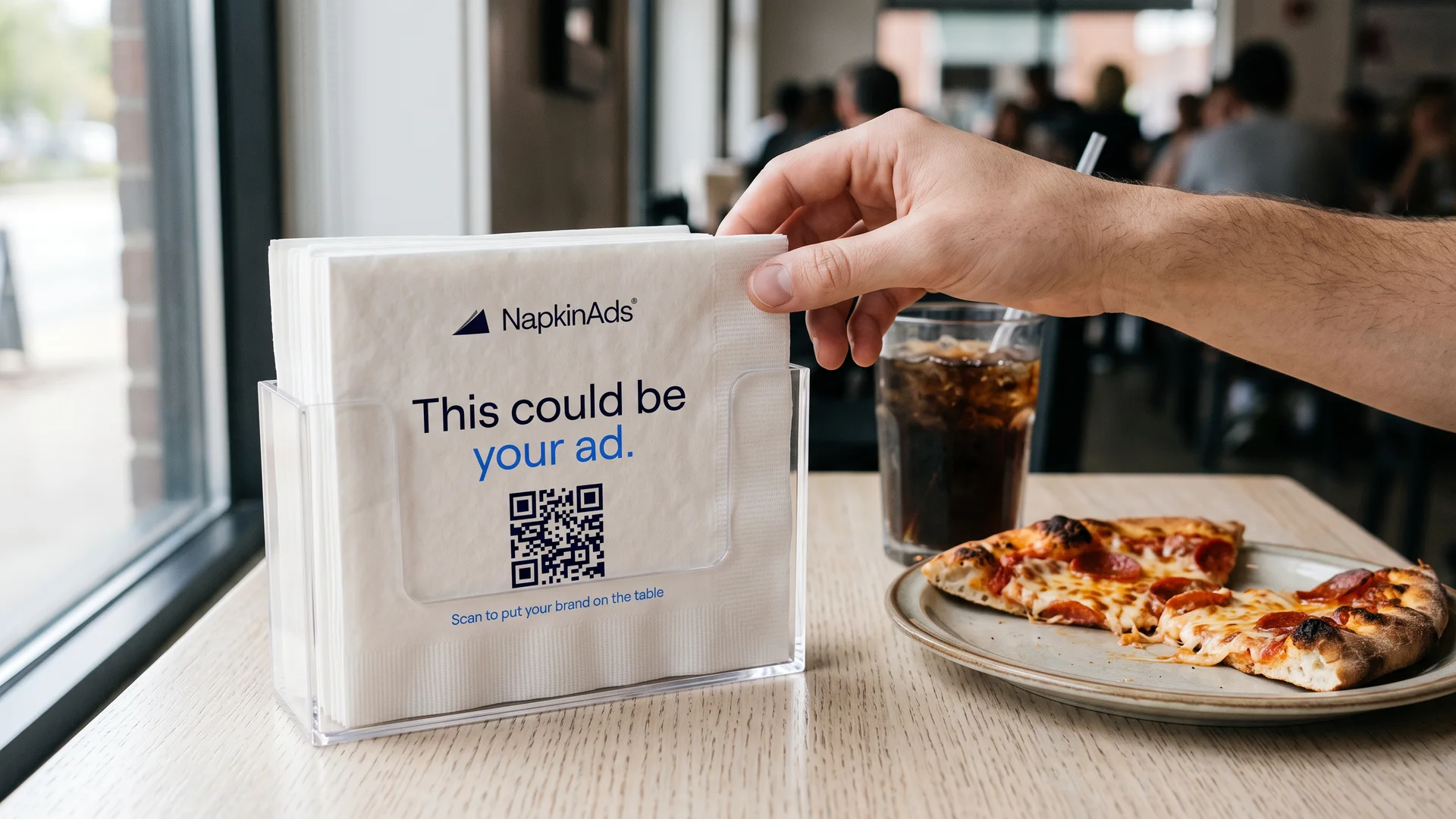
NapkinAds gets its own napkin, and it is the pitch: "This could be your ad", a QR code and one line telling you to scan it. It is designed to be left on the table at pitches and events, so the product demonstrates itself in the place it will actually run.
Brand kit
Navy on one side, the line on the other
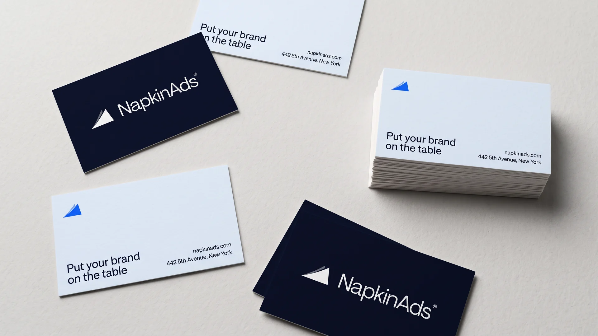
The stationery keeps to two moves: the full logo in white on ink navy, and the folded-corner mark in signal blue on snow, with the sign-off "Put your brand on the table".
Merch
Worn where the napkins are
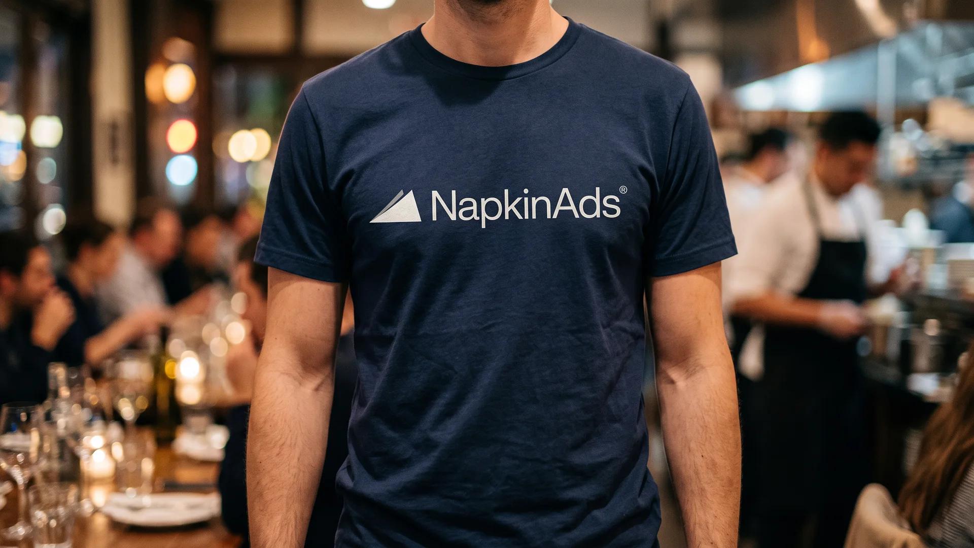
The tee is the logo and nothing else, sized to read across a busy dining room. It is designed for the team that places the napkins and runs the venue partnerships, so the brand shows up in the room before the campaign does.