A boutique studio brand,built to sell speed
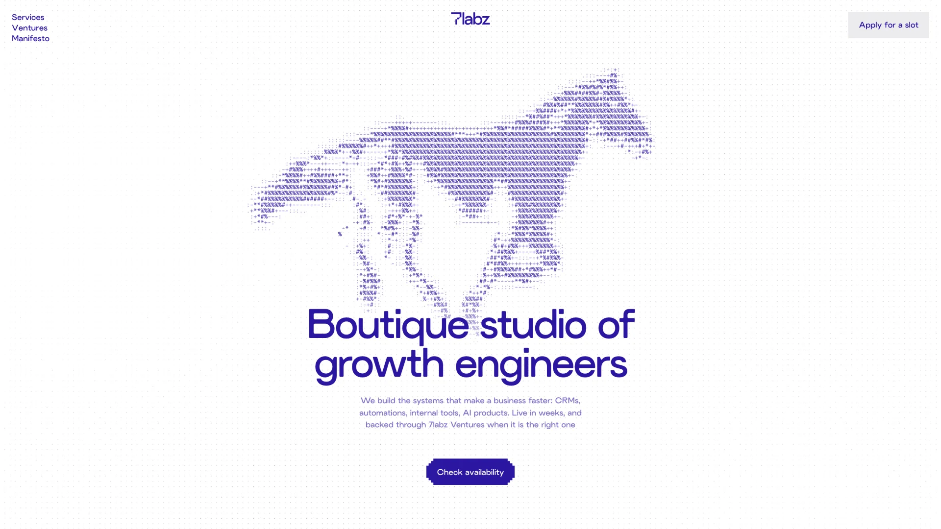
7labz is a boutique studio of growth engineers: a small team that builds CRMs, automations, internal tools, websites and AI products for businesses that have outgrown the way they run, with a venture arm that backs a few founders a year. We built the identity, the voice and the website: an indigo-first brand, one typeface, and a horse at full gallop rendered entirely in monospace characters.
Brief
Sell speed, not hours
Most studios sell hours. 7labz would rather sell speed: find the part of a business that is slow, build the thing that fixes it, and stay until the hours come back. The brand had to make that case to an owner who runs everything on spreadsheets, inboxes and memory, in one read, without agency language or stock photos of laptops and handshakes.
Identity
Indigo first, one typeface, a stepped 7
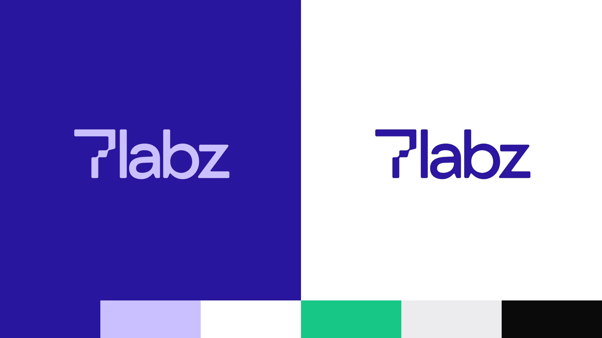
The wordmark is lowercase and one word, with a 7 cut in pixel steps so the mark carries the engineering without spelling it out. Indigo and white do almost all the work. Lavender is the text colour on indigo, and green is used like a highlighter pen: once per frame, at most. Everything is set in a single weight of ALT Picaro, with Geist Mono for labels and numbers.
The horse
Code becoming something alive
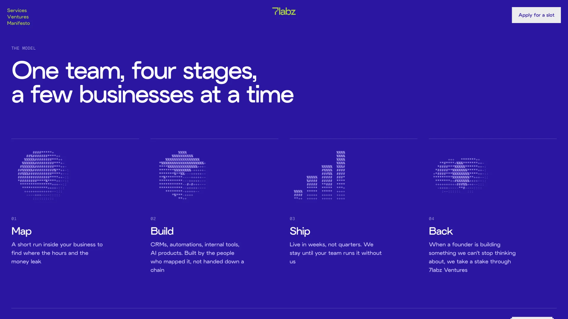
The signature image is a horse at full gallop, only ever drawn in seven monospace characters. It says speed and strength without the copy having to. The same treatment draws a mark for each stage of the model and each service, so the whole site shares one hand. In motion it loops gently and never flashes.
Website
A week, mapped
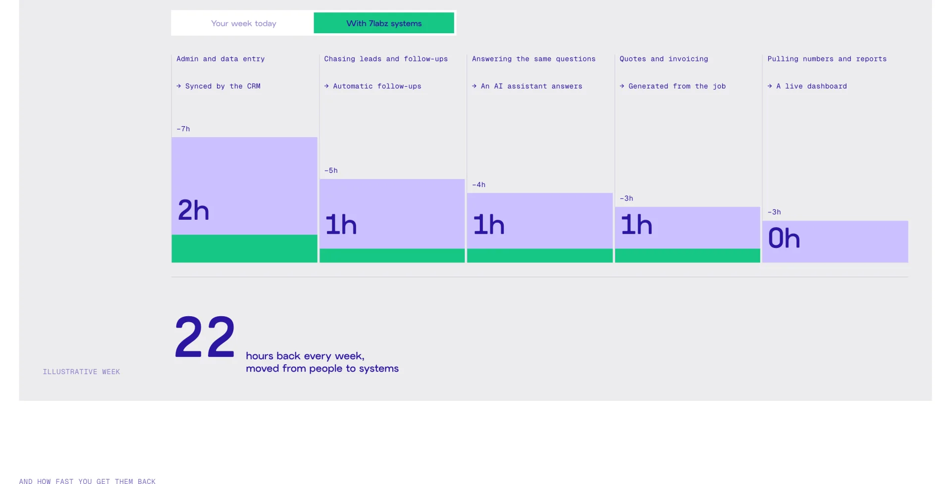
The centre of the site is a chart of where a founder’s week goes: admin, chasing leads, answering the same questions, invoicing, reporting. As you scroll, the hours move off the team and into systems, and the total counts up. It is labelled as an illustrative week, because the point is the shape of the problem, not a promise. Buttons are square with pixel-cut corners, and the call to action is to apply for a slot, not to book a call.
Voice
Plain, sure of itself, a little warm
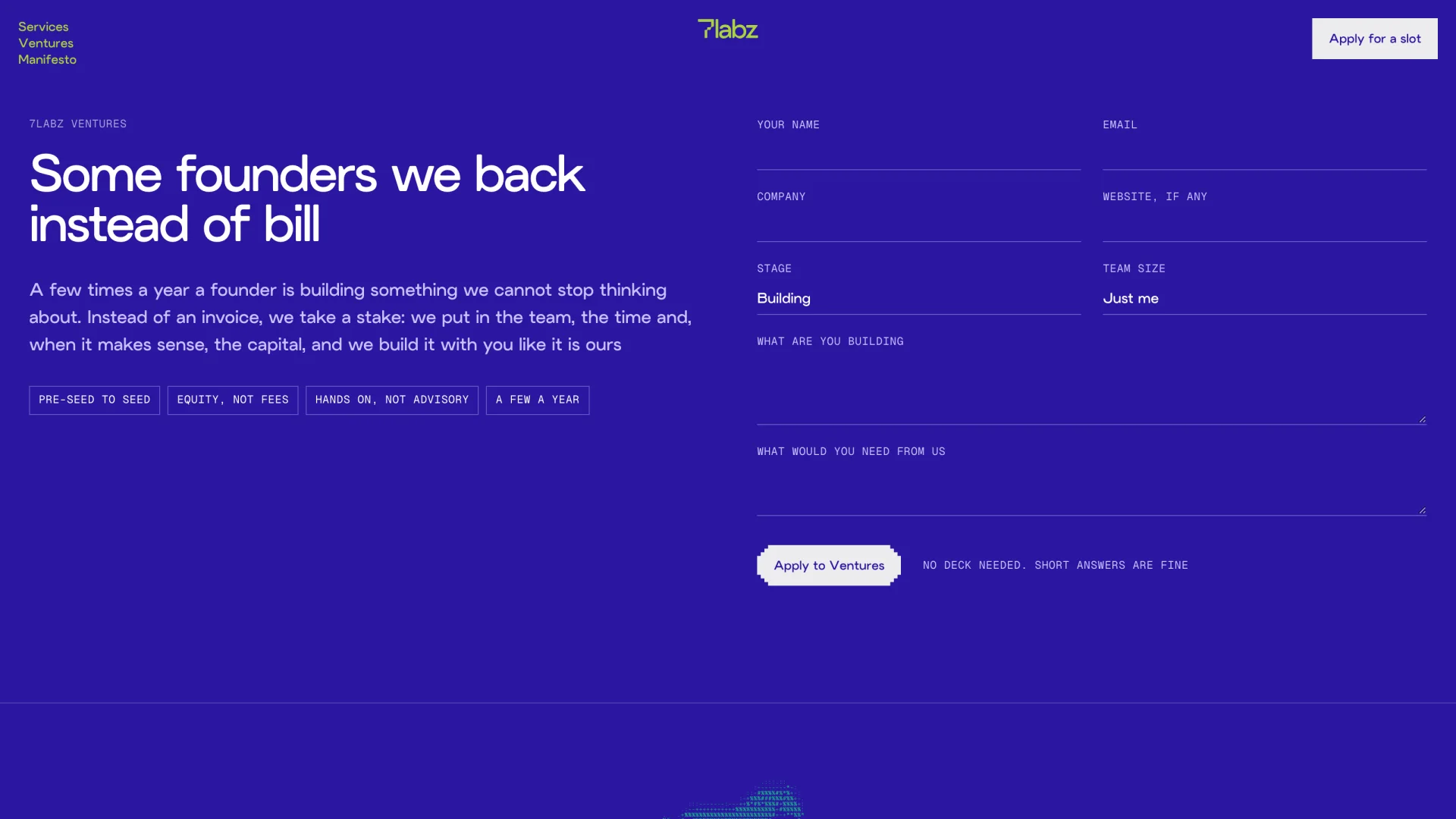
We wrote 7labz to sound like a senior engineer who likes you. Short sentences, everyday words, and the real thing named every time: spreadsheets, invoices, follow-ups. Outcomes are counted in evenings and hours, not efficiency gains. Three lines carry the values: ship it this week, say it straight, home for dinner. The venture arm gets one of its own: some founders we back instead of bill.
Brand kit
Built to be handed over
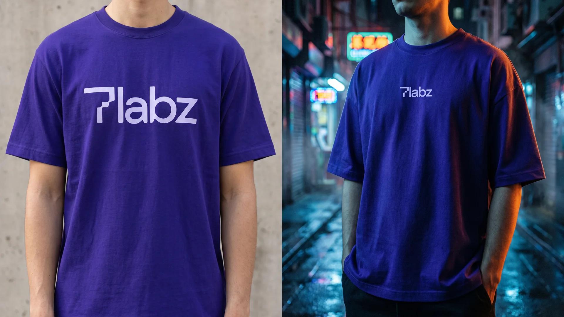
The identity ships with what the team needs to use it without us: guidelines written for whoever runs the ads, a bank of approved lines, example ads, logo files, and the horse as loops in landscape, square and vertical. We also took the wordmark onto merchandise to check it holds up at chest size and at pocket size.