A global Islamic finance brand,built to scale with clarity
Mal AI arrived with an established identity and a clear ambition: grow the brand ecosystem with assets that feel modern, trustworthy, and unmistakably rooted in Islamic finance. We led a client-side brand exploration — from narrative anchors to physical and social touchpoints — so every expression could travel globally while staying faithful to the values at the company’s foundation.
Brief
Expand the ecosystem without diluting the brand
This was not a blank page. Mal AI already had a recognizable brand; the work was to stretch it into a fuller toolkit — graphics, layouts, and applications — that product, marketing, and partners could reuse with confidence. We focused on coherence: one voice across channels, with enough range to feel alive in real campaigns and physical spaces.
Islamic foundation
Global reach, values at the core
Mal AI is built as an Islamic banking solution: worldwide in ambition, but always anchored in principles that matter to its audience. We made that foundation visible in the work — not as decoration, but as structure. The brand had to read as contemporary fintech while signalling trust, fairness, and restraint in line with what clients expect from Sharia-aligned finance.
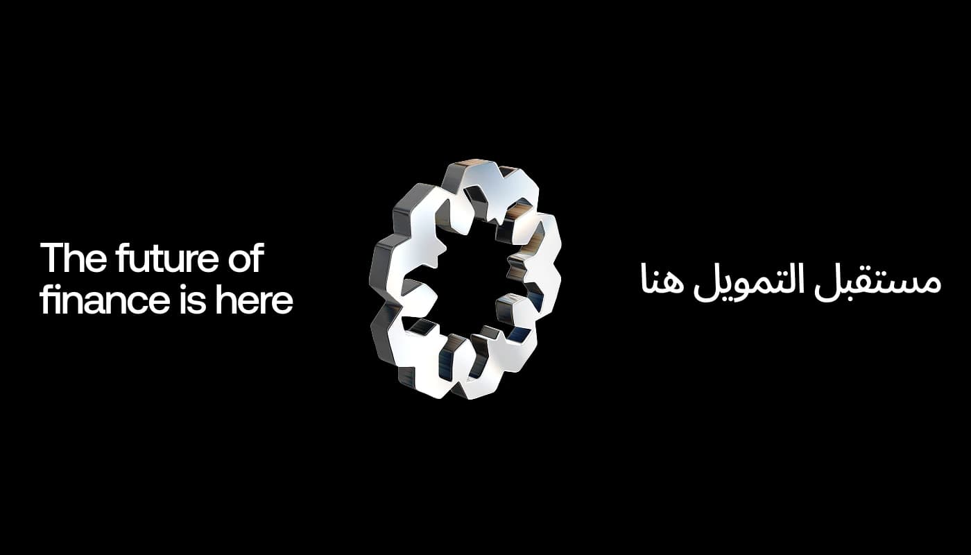
Islamic Grid
Adl, Amanah, Barakah, Tawazun
We introduced a unifying graphic asset — the Islamic Grid — that carries the brand’s moral compass into layout and storytelling. Each quadrant aligns with a value: Adl (justice), Amanah (trustworthiness), Barakah (blessing and thriving), and Tawazun (balance). Together they form a repeatable scaffold for key visuals, campaigns, and interface-adjacent surfaces so the identity stays legible whether the context is subtle or bold.
Latin & Arabic
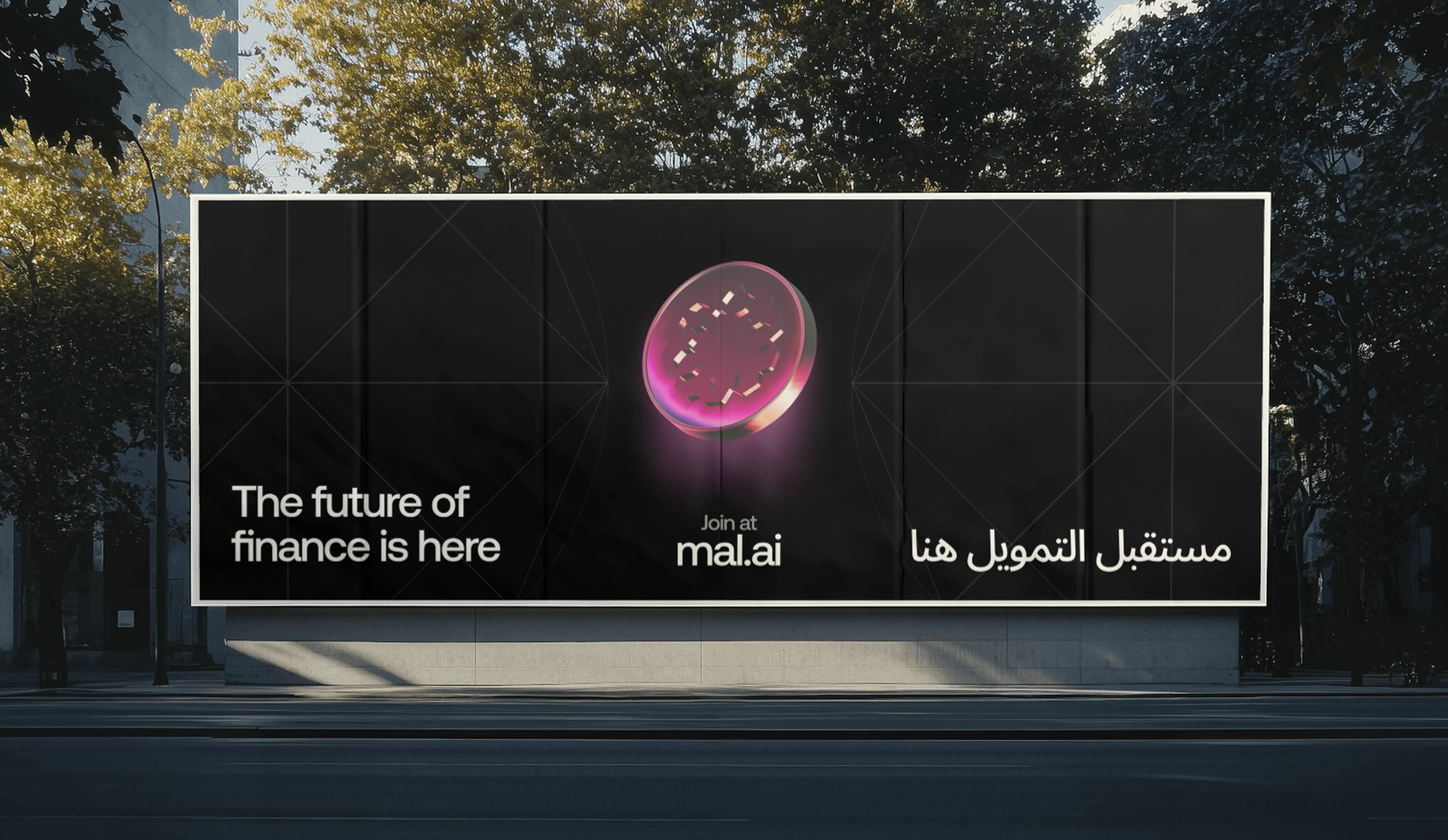
One typographic voice, two scripts
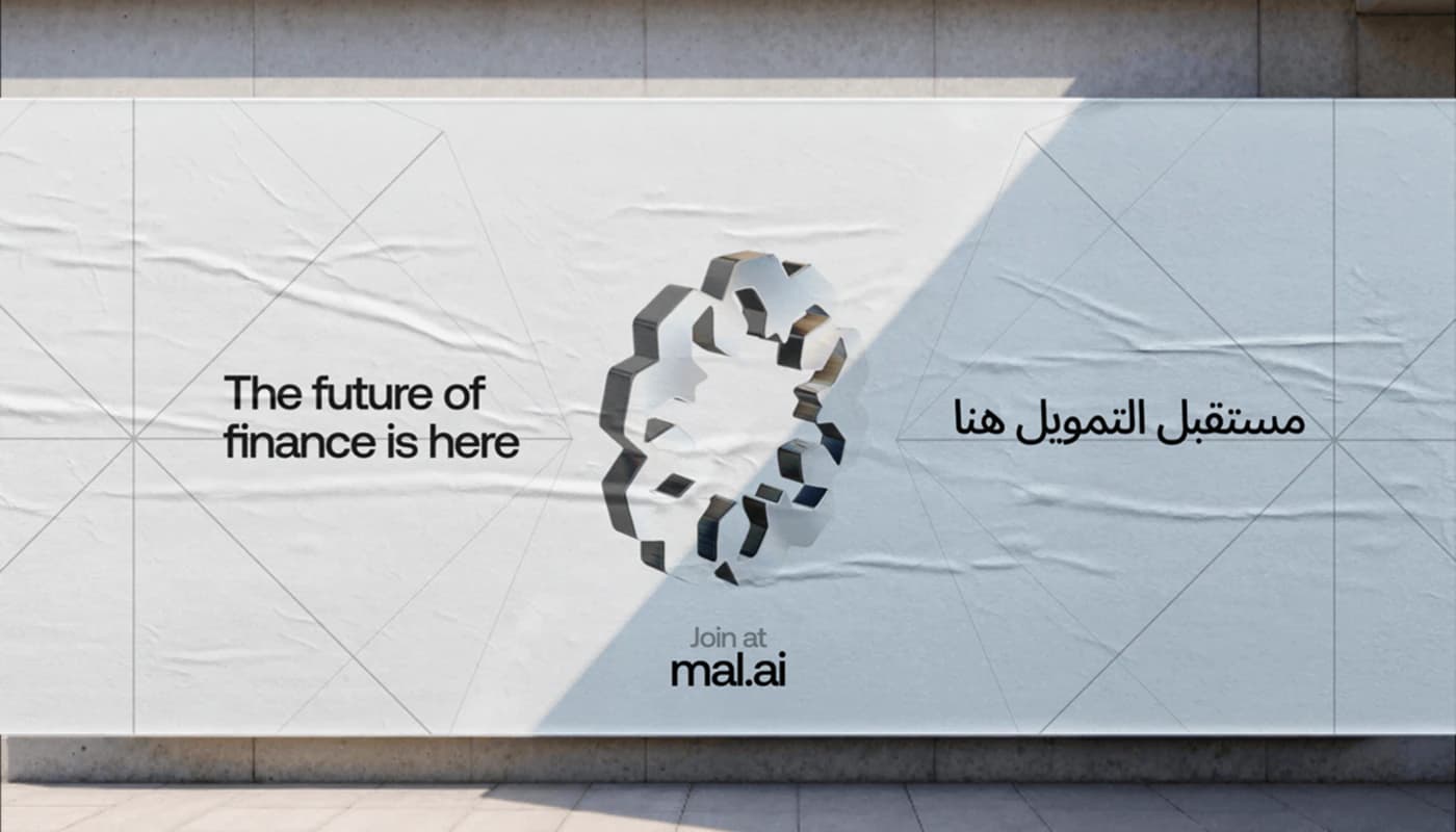
Islamic finance speaks to diverse regions; bilingual expression was essential. We set the system in Aeonik for its balanced Latin and Arabic cuts, so headlines and supporting copy could switch scripts without breaking rhythm or hierarchy. Across the most visible creative assets, we showed both Latin and Arabic side by side — reinforcing that this is a global brand with an inclusive, intentional voice.
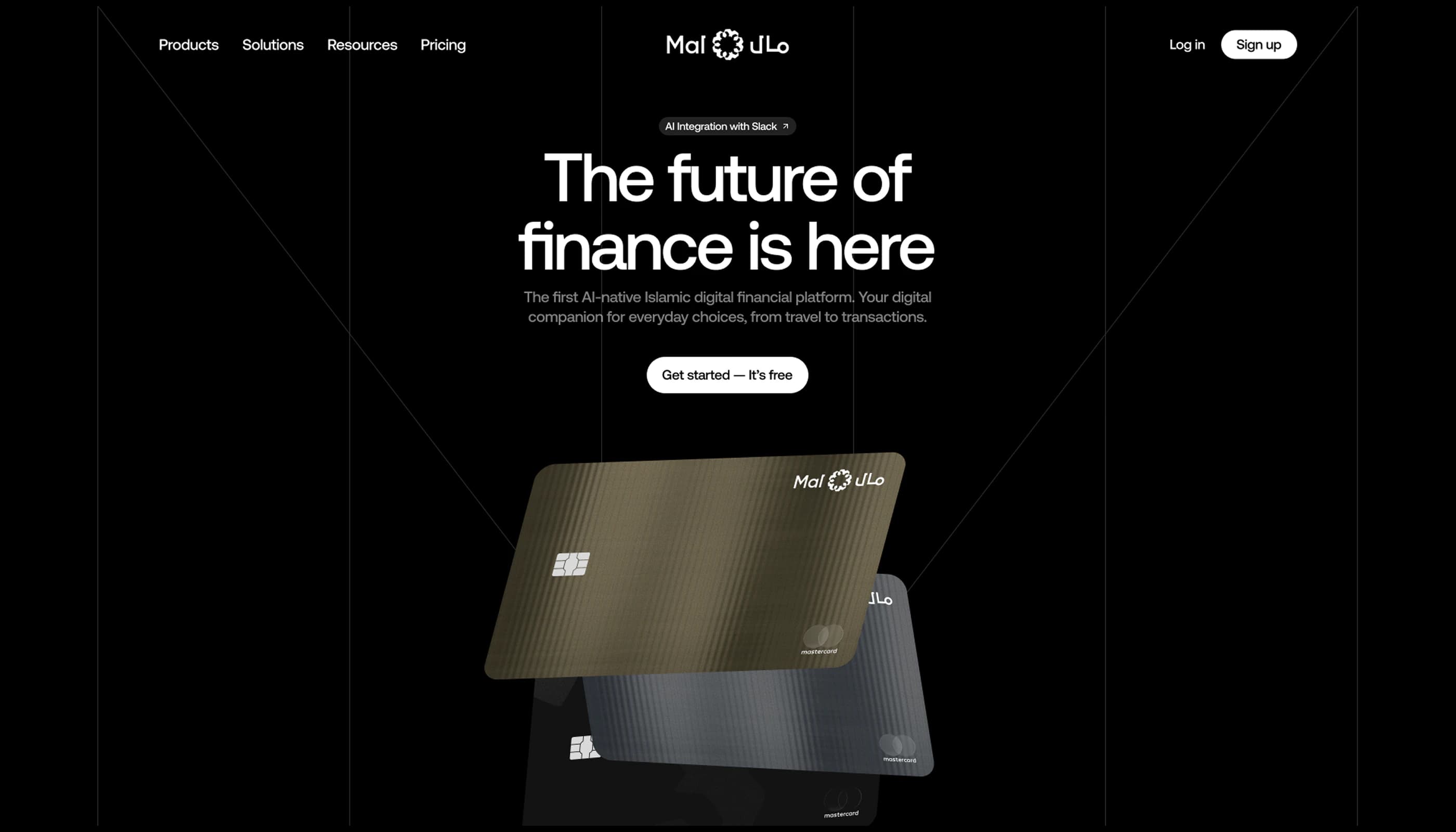
Card progression
Four tiers, one clear ladder
The card programme needed a distinguished hierarchy: not just different colors, but a progression people recognize at a glance. We defined four levels — Mal (standard plastic), Mal Metal, Mal Gold, and Mal Black Metal — each with its own finish, contrast, and detail while sharing a single design DNA. The result is a lineup that feels premium and orderly, with status communicated through material and craft rather than noise.
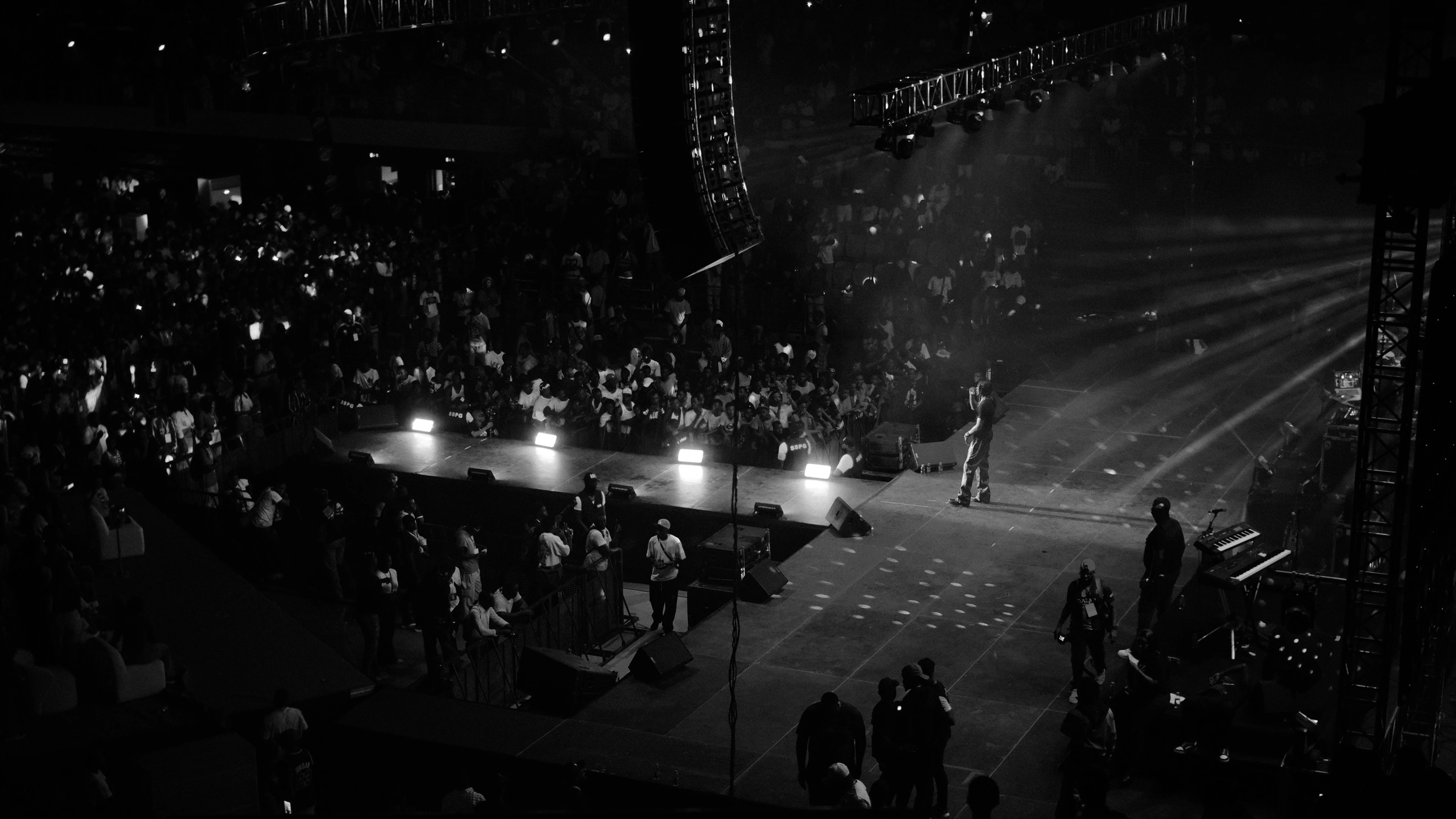
Presence
From merch and streets to feeds and the homepage
To stress-test the system, we carried the identity into physical and social contexts: merchandise, outdoor advertising, social media mockups, and a hero section for the site. Each format had to prove that the Islamic Grid, typography, and card language could scale — whether someone sees a poster across the street, a story on their phone, or the first fold of the product story online.