Intimacy, elevated,from brand to checkout
DrinkLust is a U.S.-based e-commerce brand selling fast-acting intimacy boosters — shots, honey packs, and gummies — formulated for both partners and built to feel premium, not clinical. verteal came in as a long-term partner: brand and packaging direction, the full Shopify store, email marketing, and a visual layer of 3D, illustration, and motion that makes a sensitive category feel confident and desirable. The work has scaled with the business — including a major collaboration with Amber Rose — without losing the through-line that ties every touchpoint together.
Brief
Wellness with heat, shame-free and shelf-ready
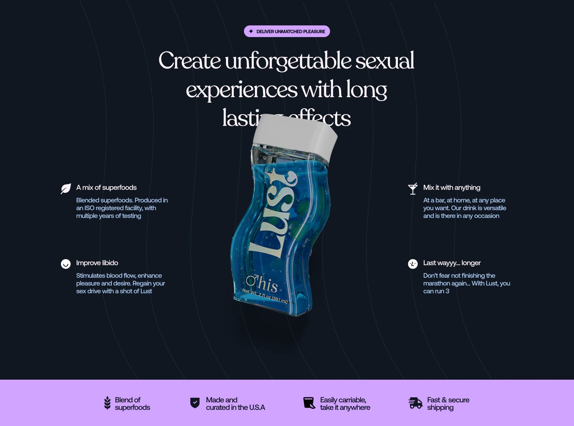
DrinkLust sits in a category where tone matters as much as the formula. The products are real — superfood blends, ISO-registered production, formats people can carry anywhere — but the brand had to lead with desire and ease, not awkward euphemism. Our brief was end-to-end: help shape brand decisions, define packaging that reads at a glance, and build a store and marketing system that converts while still feeling human. Every asset had to work for shots, gummies, and honey, for "his" and "hers," and for a customer who might discover Lust on a phone at midnight or in a bar via a QR code on a napkin.
Brand & packaging
Decisions that travel across formats
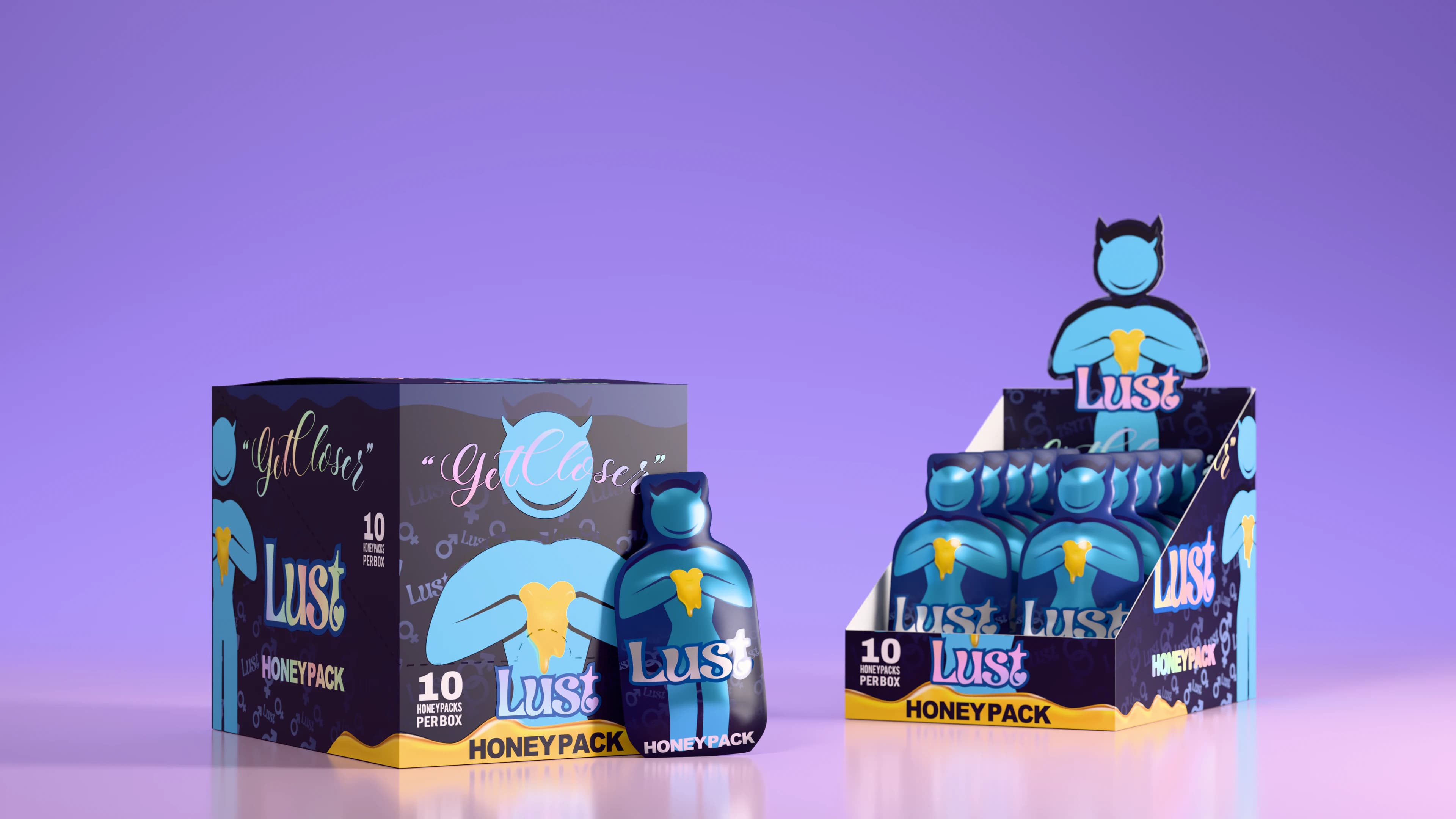
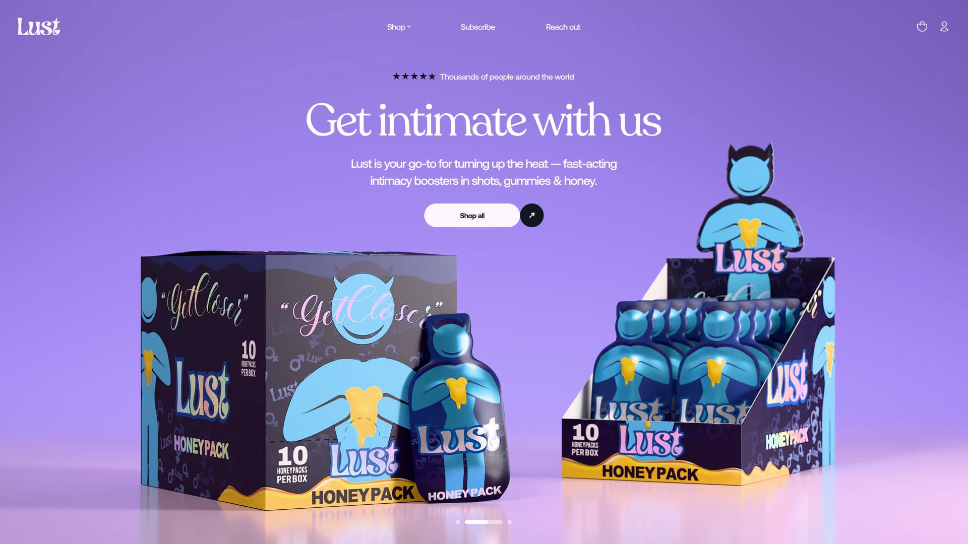
We worked closely with DrinkLust on the brand layer — not just how it looks, but what it stands for in a crowded wellness aisle. Typography leans serif and self-assured; colour moves between deep navy, soft lavender, and product-specific cues so "his" and "hers" are instant without feeling gimmicky. Packaging spans contoured shot bottles, honey sachets, and gummy formats, each with its own silhouette but shared DNA: the Lust wordmark, gender markers where relevant, and copy that is direct ("Get Closer," "Take a shot and lay back") without tipping into parody. The goal was a lineup that feels collectible and credible — something you are not embarrassed to leave on a nightstand or drop into a gift bag.
Store
Design, development, and full setup
We designed and built the e-commerce experience on Shopify — from homepage architecture to product templates, subscription paths, and the small UX details that reduce friction in a high-intent purchase. Hero sections carry social proof ("More than 5,000 shots taken"), clear benefit stacks, and CTAs that stay visible over rich photography and 3D renders. Product discovery is split by format and audience so someone landing cold can find gummies, honey, or shots without hunting. Behind the scenes, the store was set up completely: collections, flows, and the infrastructure DrinkLust needed to sell, fulfil, and iterate — not a theme with a logo swapped in.
3D & motion
Products you want to pick up
Intimacy products live or die on trust and tactility — people need to believe in what they are buying before they ever taste it. We produced original 3D models of bottles, honey packs, and retail display units, then lit and animated them for the site and campaigns: condensation on glass, liquid colour, soft environments that suggest mood without cliché. Motion design extends that language into scroll moments, loops, and campaign cut-downs so the brand feels alive in feeds and on the homepage, not frozen in static renders. The 3D layer is not decoration; it is how Lust proves craft before a single review is read.
Illustration
Character, heat, and a mascot with personality
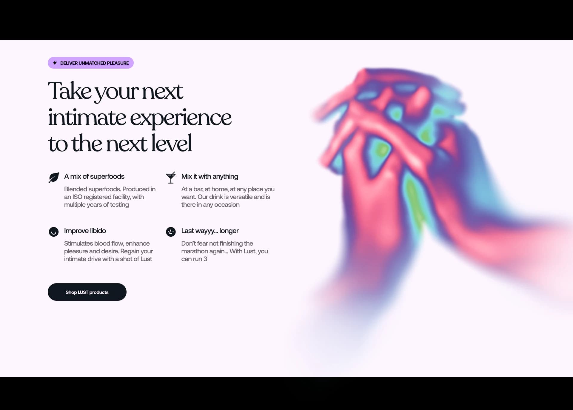
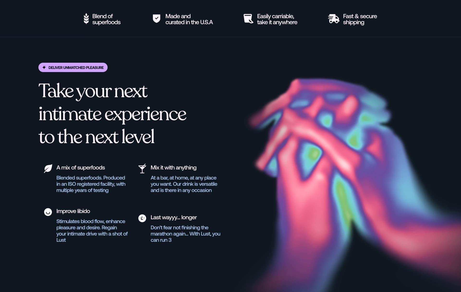
Not everything in the system is photographic or rendered. We developed illustration that gives Lust a warmer, more playful register — including a horned mascot on honey packaging that balances cheeky and premium, and abstract "thermal" hand imagery that signals closeness and chemistry without explicit content. Those assets flex across light and dark UI themes, email modules, and social formats so the brand can shift tone by channel while staying recognisable. Illustration is where Lust gets to be bold and a little mischievous — the counterweight to the serif restraint in type.
Email marketing
Lifecycle creative that matches the store
Email is a core revenue channel for DTC wellness, and Lust’s templates had to feel like an extension of the site — same typography, same confidence, same product stories. We designed campaigns and lifecycle flows that showcase formats, social proof, and limited drops with layouts that work on mobile first. Creative pulls from the 3D and illustration library so broadcasts and automations do not look like a different brand in the inbox. The system is built to scale: new flavours, bundles, and collaborations can slot in without redesigning from zero.
Amber Rose
A partnership that amplifies the brand
DrinkLust’s collaboration with Amber Rose — model, entrepreneur, and outspoken advocate for sex-positive culture — marks a step change in reach and credibility. Together they launched Lust Amber Rose, an orange-flavoured intimacy shot built on the same natural-ingredient formula, positioned for both men and women. Amber’s voice ("bold, refreshing, and unforgettable") matches how the brand already shows up visually. The launch extended into nightlife marketing — branded napkins with QR codes in bars and clubs nationwide — so discovery happens in the moment the product is meant for. Our work had to hold up at that scale: packaging, 3D, web, and email ready for a spotlight partnership without a separate "celebrity skin."
Partnership
A client relationship that keeps building
DrinkLust is a verteal client across brand, product, and performance — not a one-off rebrand or a single landing page. As the catalogue grows and partnerships like Amber Rose come online, the system we built is meant to absorb new SKUs, campaigns, and channels without starting over. That continuity is the point: one partner who already knows the category, the constraints, and the tone, so every new chapter feels like Lust, only louder.